

Redesigning the mobile and desktop experience for Cuba's largest airline.
Branding /UX Design / UI Design / Prototyping / User Testing
Overview
With the loosening of restrictions on travel to Cuba and a number of American carriers now offering flights to the Caribbean nation for the first time in decades, Cubana -- the country's largest airline -- saw an opportunity to increase its market share of traffic in and out of Havana, while also exposing American tourists to its brand for the very first time.
To do so, they knew they needed to completely overhaul their existing website, ensuring it would work seamlessly on both mobile and desktop, with a well-thought-out user experience to match. Although an app is on the long-term roadmap, the primary focus for this project was to develop a responsive site that matched the modern look and feel of their largest competitors.
Research and Analysis
To begin the design research process, a competitive analysis was conducted, analyzing the desktop and mobile sites of some of the largest US and Latin American carriers currently operating flights to and from the island.
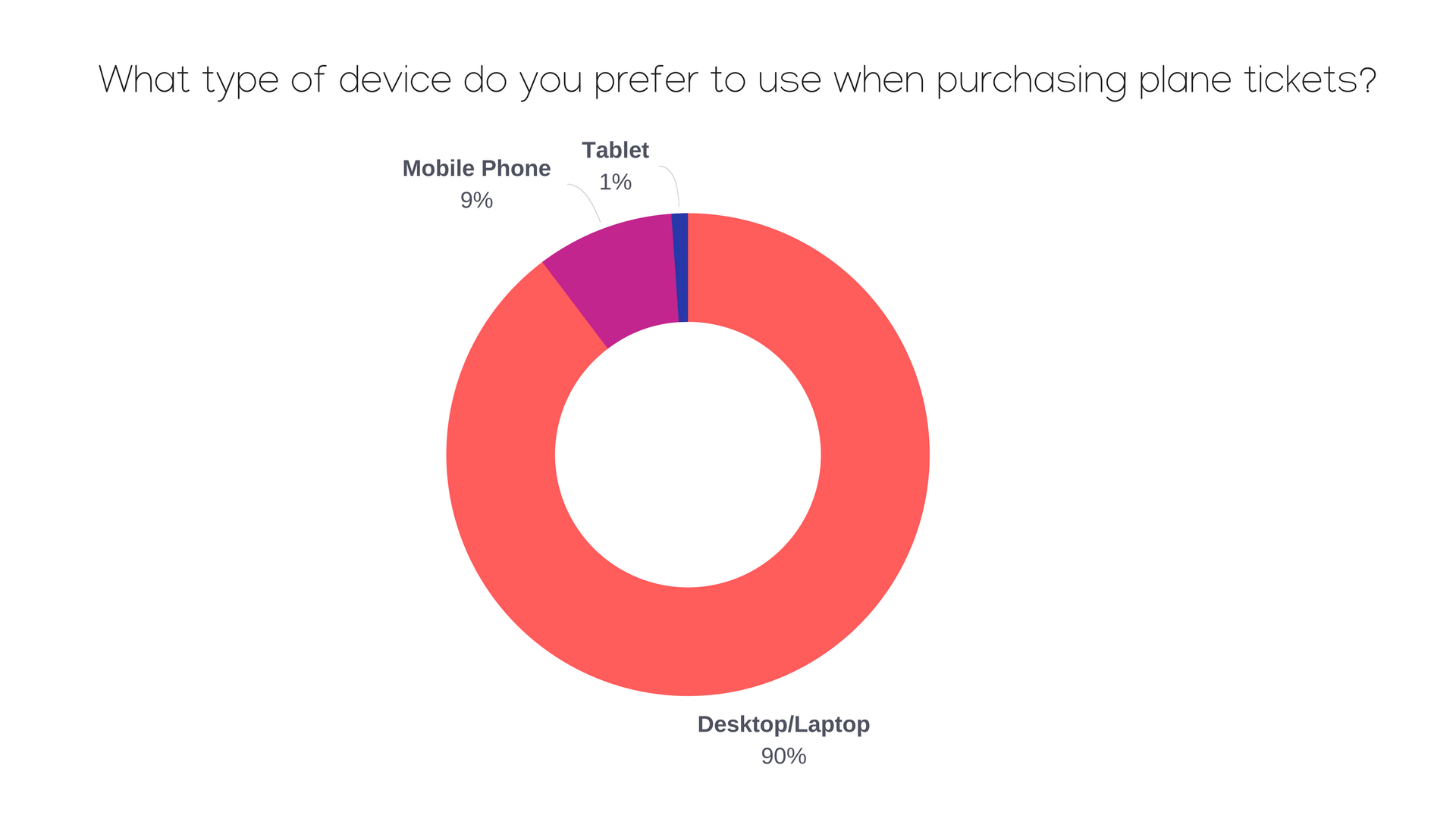
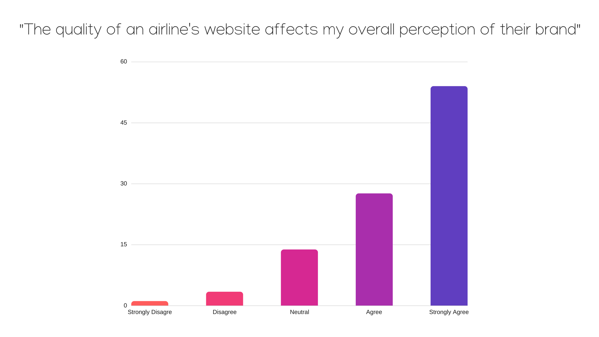
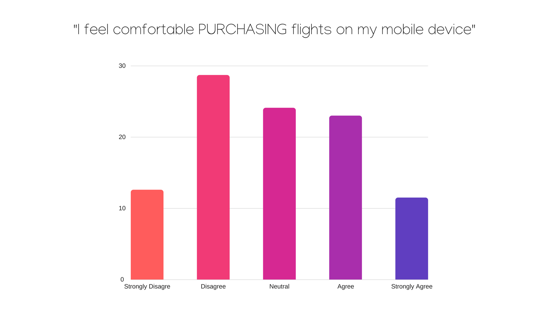
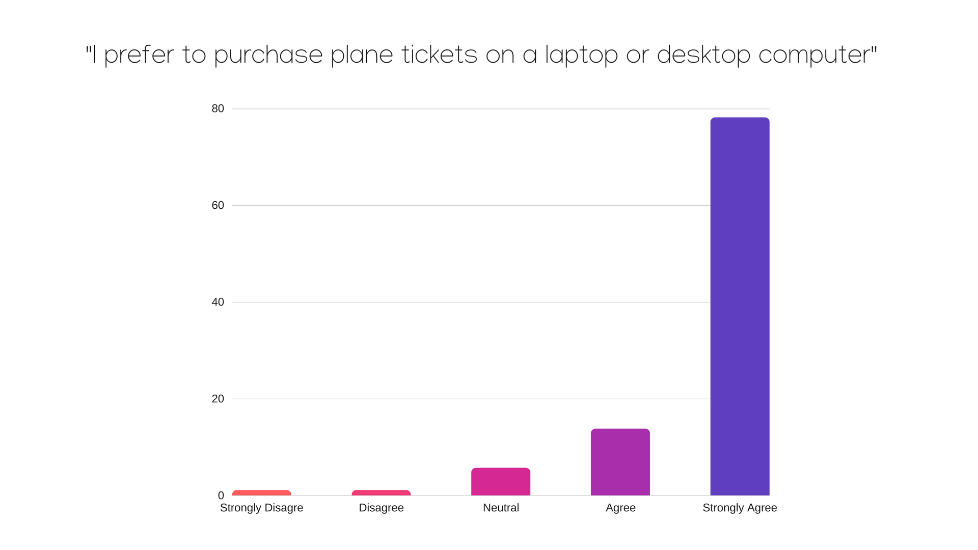
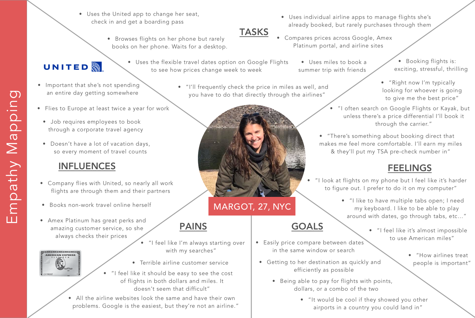
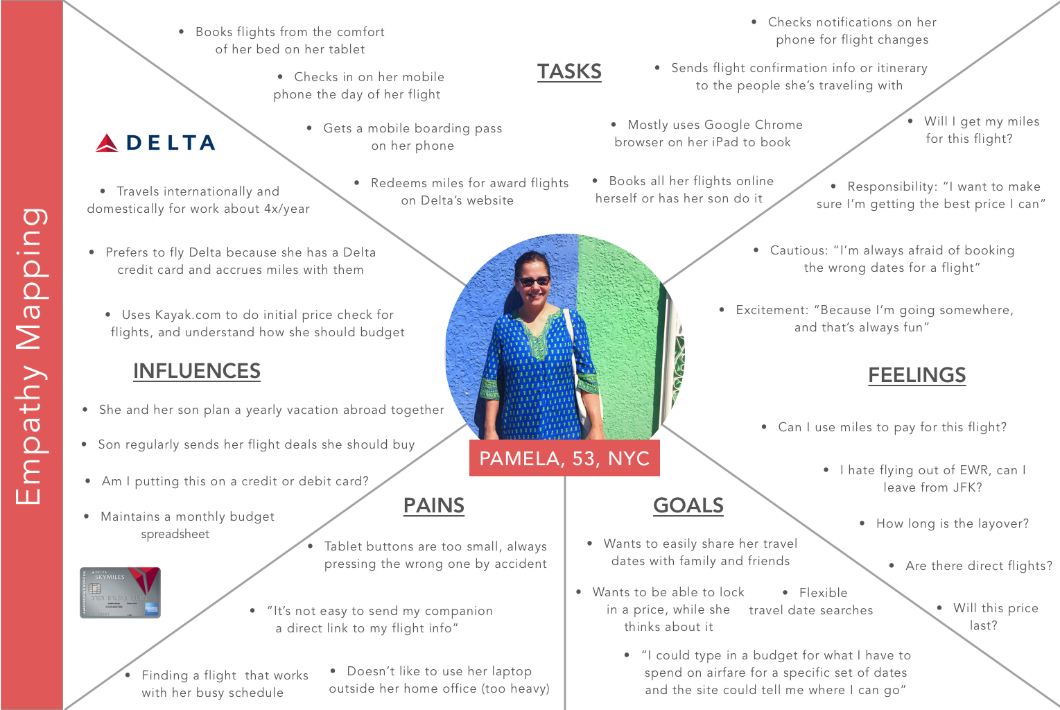
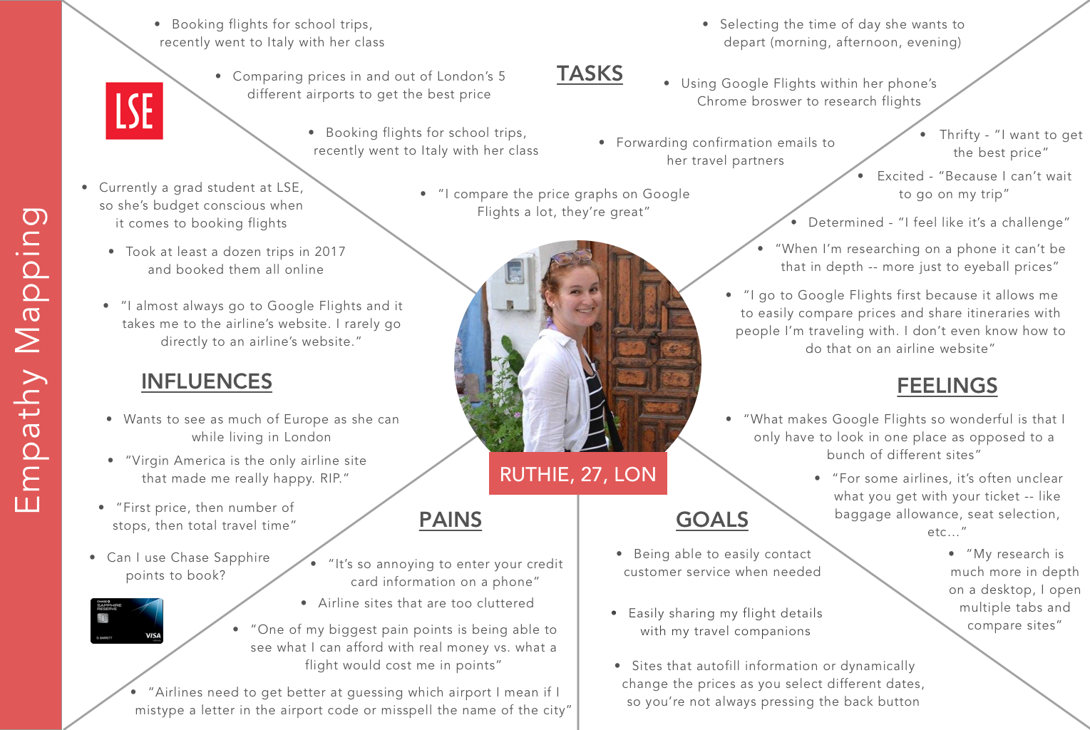
Once the sites were audited, 30 minute 1:1 interviews were held with frequent travelers in New York and London. A quantitative survey was also conducted to identify which site features were most crucial to users when researching and booking flights, as well as to match particular actions or behaviors to specific device types.
Competitive Analysis of Major Carriers Currently Flying to Cuba
Empathy Mapping
From those initial research endeavours, I then built out detailed empathy maps to examine the most critical pain points, influences, and site tasks that users encounter in their journey researching and booking air travel online.
Brand Refresh
One key insight that emerged from the initial research phase was that fewer than 10% of travelers surveyed had even heard of Cubana, compared to similar Latin American airlines like Aeromexico, which nearly 80% of respondents were familiar with. On top of that, their existing brand felt outdated and notably less modern than their biggest competitors, relying on harsh color tones and blocky serif fonts to convey their brand image to the world.
To overcome that obstacle and help even the playing field, a brand refresh was also planned to help bring Cubana into the 21st century.
Old Brand Identity v. New Brand Identity
Interaction Design and Task Flows
The next step was to identify the primary task flows users would need to complete on the site and the devices on which they were most likely to undertake these actions.
Based on the research findings, it was determined that users would most likely be searching for and booking flights on a desktop, while they’d most likely use their mobile device to check in for a pre-existing reservation.
Task Flow for Booking a New Flight on Cubana's Website
Task Flow for Checking Into a Flight on Cubana's Website
Wireframing
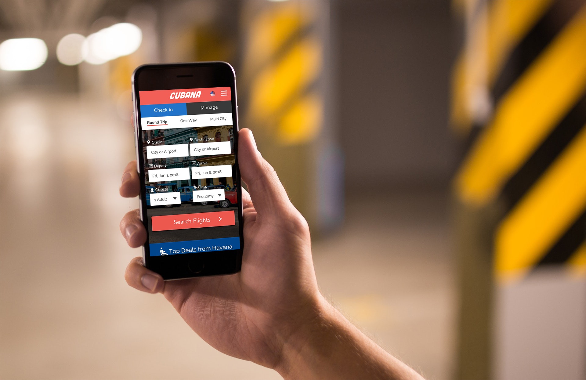
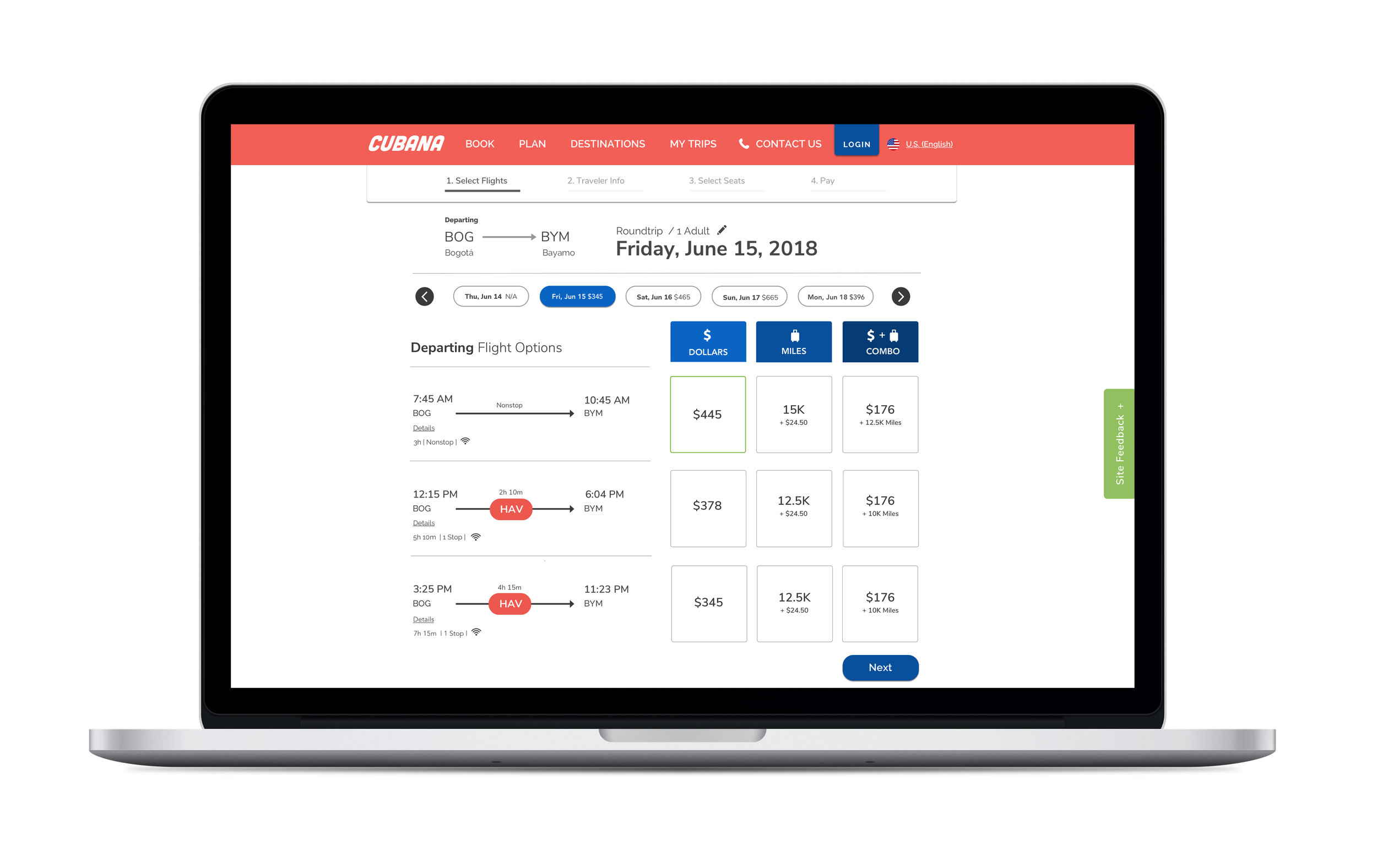
With the key task flows mapped out, a complete set of wireframes was created for both mobile and desktop. For mobile devices, the primary flow guided users through checking in for a flight on their smartphone, whereas for desktop the primary flow allowed users to search, select, and pay for flights to the destination of their choosing.
Selection of Wireframes for Cubana's Mobile Prototype
Selection of Wireframes for Cubana's Desktop Prototype
Once the wireframes were complete, a full UI kit was developed based on the newly refreshed brand identity, covering everything from photography and button styles, to typography, iconography and seat mapping.
UI Kit and Design
Primary UI Kit
With the UI kit complete and a style guide to accompany it, the screen designs for both the mobile and desktop interfaces were finalized before moving onto the prototyping phase.
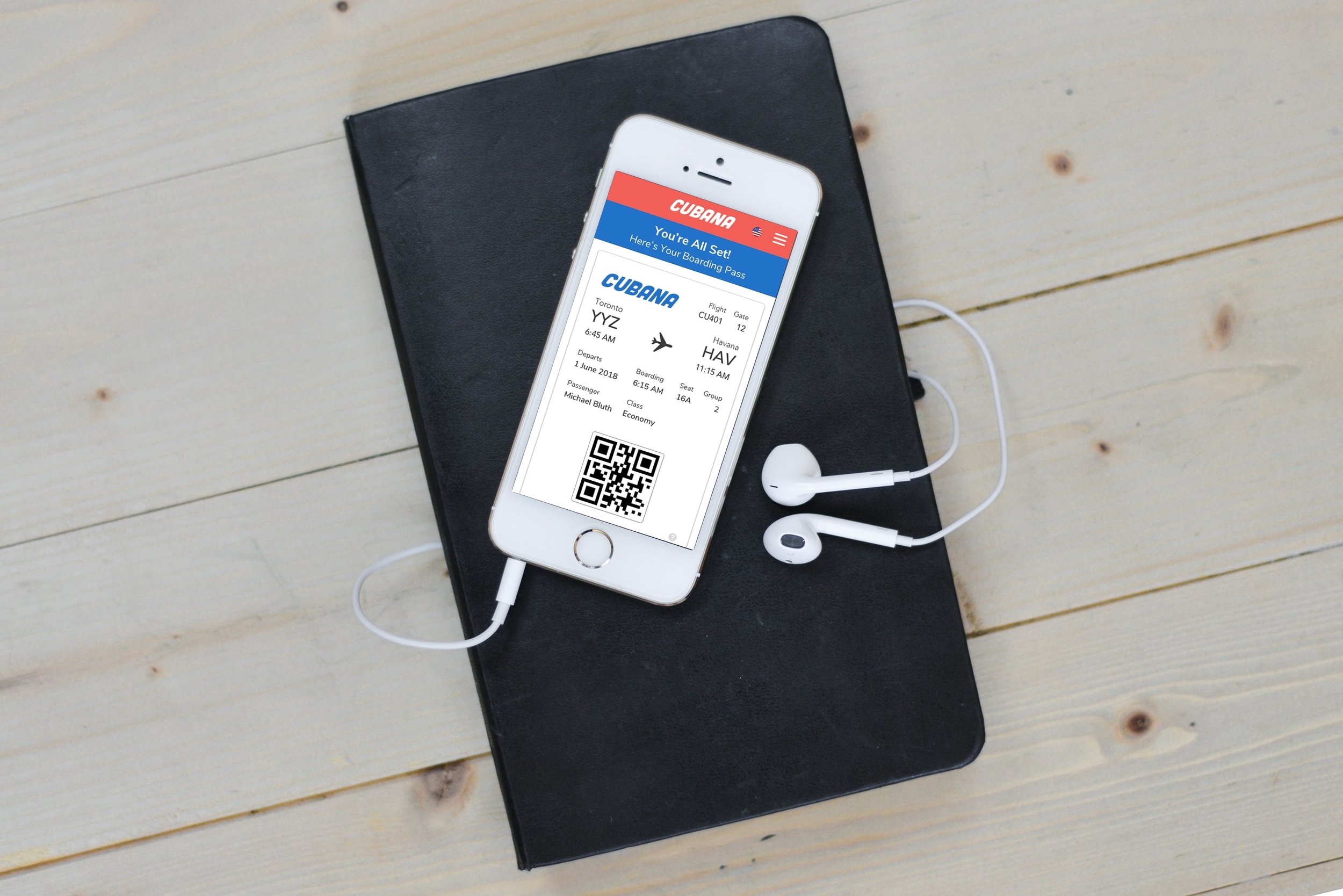
Key Screens for Mobile Check In Flow
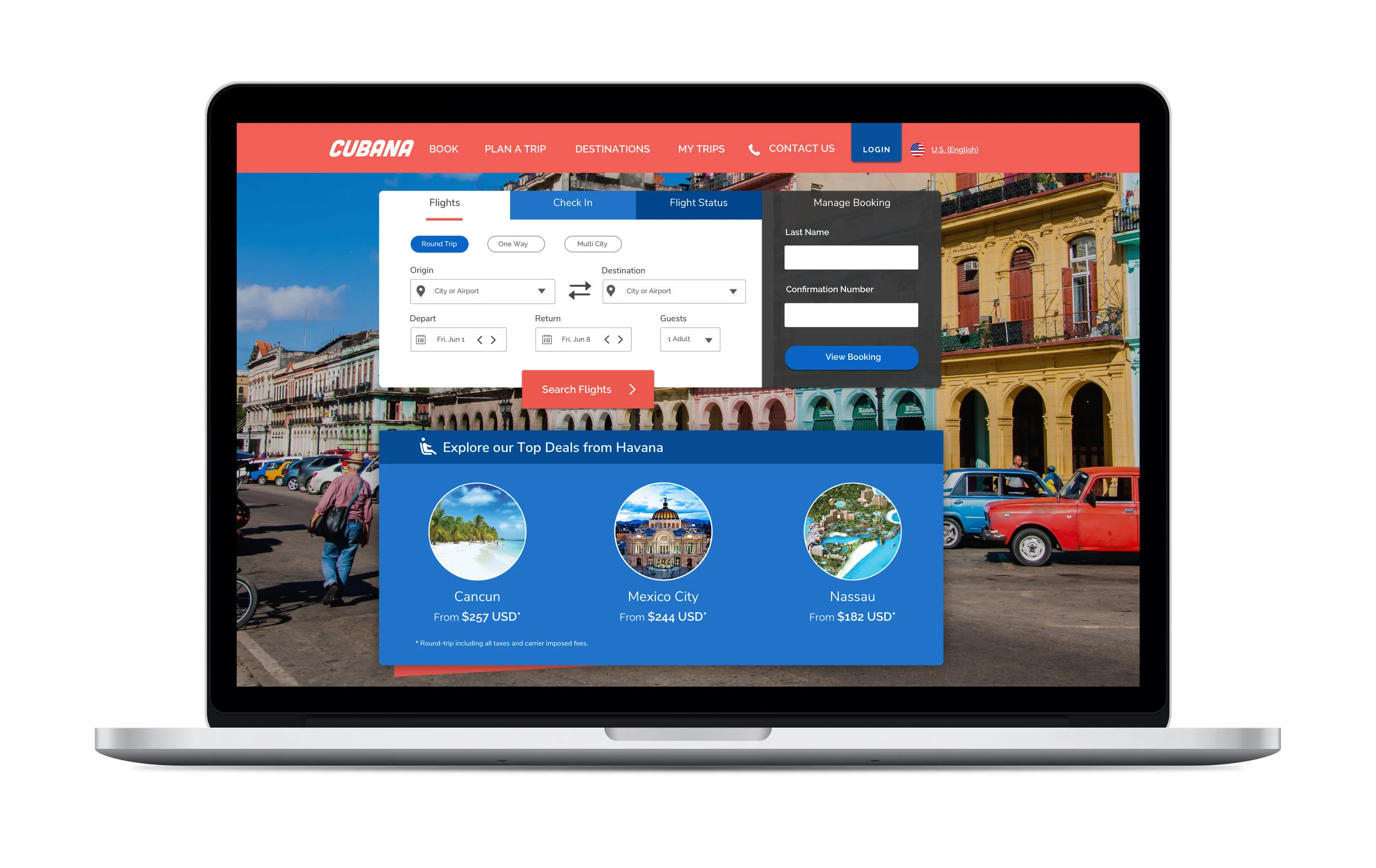
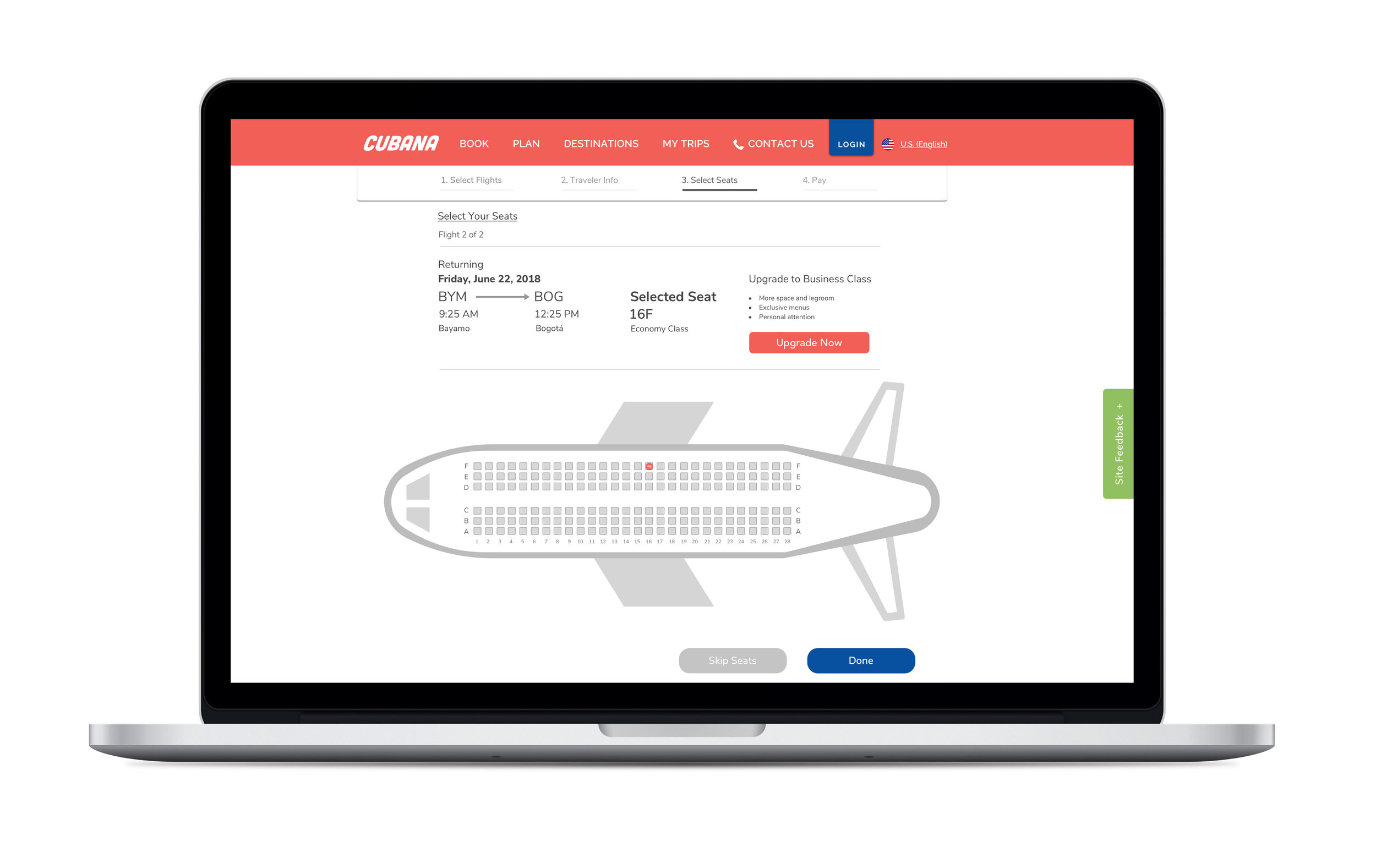
Redesigned Desktop Homepage

Old Cubana Site
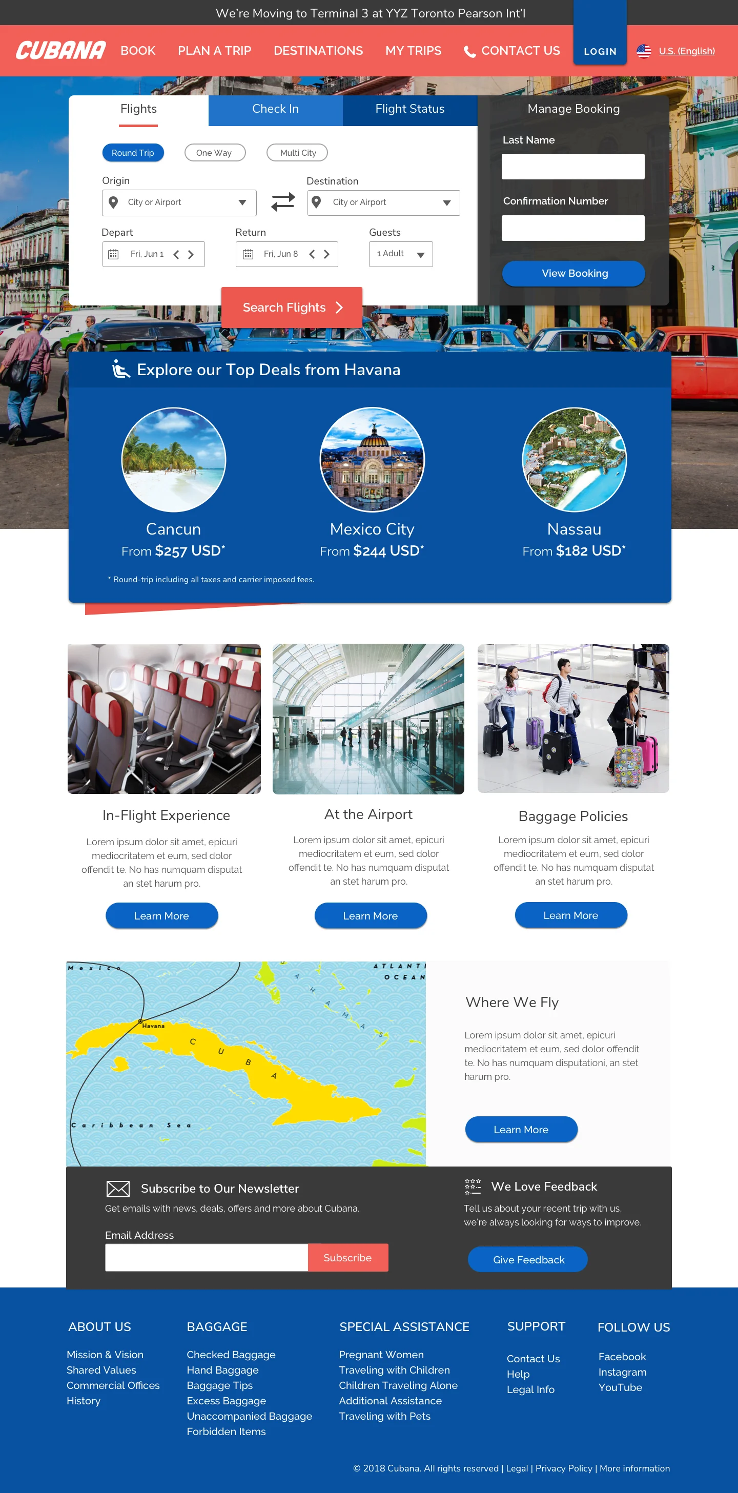
New Cubana Site
Building a Prototype
Lastly, using both Sketch and InVision, the screens were stitched together to form a high fidelity prototype that could be tested in person with users.
Usability Testing
The Sketch prototype was tested 1:1 with users to gauge participants’ ease of use completing the specified tasks and assess their reaction to the redesigned website.
The primary goals of the usability tests were to:
- Evaluate participants’ impression of the redesigned experience, as compared Cubana's existing site
- Identify possible friction points in the check in and flight search experiences
Participant overview:
- 8 participants in total, 6 women and 2 men
- All participants lived in either New York or London
- Age range for participants was between 26 and 53 years old
Key takeaways:
- All participants were able to complete the mobile check in process in less than 60 seconds
- All participants were able to complete the desktop flight search they were asked to execute
“I would genuinely like to use this site. Bravo!”
“I love that ‘Manage Booking’ is so prominent because that’s always the first thing I look for. It’s a beauty! ”
“Amazing! What an improvement over their current site. ”
Overall, the new site was very well received by users. Many participants even remarked that they wished other airlines' websites were laid out in a similar fashion, as they found the site easy to navigate and very visually appealing.
Once testing was complete, small changes were made to both prototypes, including the ability to add your mobile boarding pass to Apple Wallet for iOS and changing the ticket selection on both devices from the original radio buttons to a segmented control.
The resulting designs were proofed, redlined, and readied for handoff to the development team to complete the final build.